Enhancing B2B Website Navigation: User Experience
Dec 2022Defining Website Navigation
As defined by HubSpot - Website navigation is a collection of user interface components that helps visitors find content and features on a site.
These components take the form of copy, link text and buttons, and menus.
In the simplest form, website navigation is a series of menus, links, and buttons that allow visitors to move around a website and find the content they need. It's an important design element that should be easy to use and make sense to users. Depending on the type of website, navigation may take the form of a navigation bar, drop-down menus, breadcrumbs, or a combination of these.
Website navigation is an essential part of website design, as it helps users find the content they need. When designing a website, it's important to consider the user experience and make sure the navigation is intuitive and easy to use. It should also be visually appealing, as it's one of the first things visitors will notice when they arrive at the site.
Good Practice
Before creating a website, it is generally good practice to create your website structure first.
This is a list of pages, connected to those they link to or from - structured as a page tree.
Here’s an example of ours:
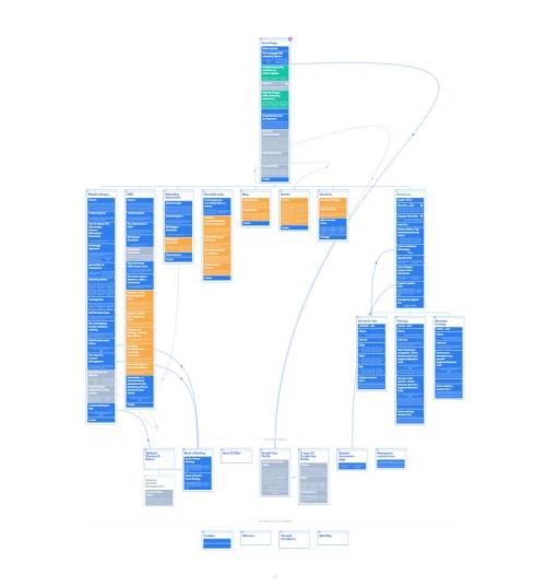
Using sites such as octopus.do is a brilliant way to visualise how your website is going to be laid out, the various user journeys that can be taken by visitors along with a visual way to represent your sales-funnel, before ever creating a website.
With Octopus.do, you’re able to visually structure the pages how you’d like, freely move pages around and make notes.
If you’re more drawn to offline methods of planning, the same can be achieved with post-it notes, pen and paper!
Whatever you choose to use, planning your website structure wireframe is a recommended first step in the process of creating a site - helping you to create a website based on the user experience and journey. If you'd like to know Intergages process when it comes to designing lead generating websites, check our blog on it here, or download our whitepaper to discover more!
If you’ve already created your website, it may be worth performing an exercise to count how many clicks it takes to access certain important information.
If the number is above 3-5, it may be time to reconsider where the CTAs on your website lead and prioritise some over others.
Make sure you're including clear labels, descriptive links and avoid having too many menus and CTAs for the user to choose from.
Take your strategy to the next level - click here to read our blog on types of CTAs and how to use them!